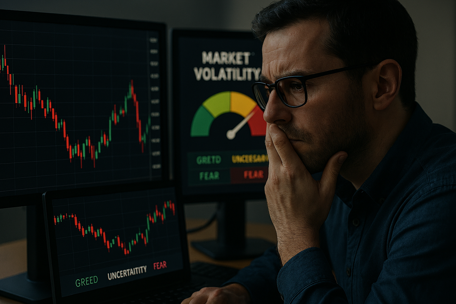
If you want a fast, honest way to describe modern markets, start with this: markets are not just prices; they are patterns of stress. And those patterns show up most clearly in volatility, how violently prices are moving, and how expensive it is to insure against that movement.
Most people encounter volatility as a single number. VIX is up. Bond volatility is down. Currency markets are “quiet.” But that is like describing weather using only the temperature. Real weather is a configuration: temperature, humidity, wind, pressure, cloud cover, moving together in recognizable ways. Markets are similar. On any given day, the market presents a cross-asset “volatility picture”: equities are choppy or calm; rates are stable or skittish; credit spreads are placid or strained; currencies are orderly or jumpy; commodities are trending smoothly or whipsawing. Each of these is a piece of the same atmospheric system. When you put them together, you get something more informative than any one gauge.
That “put them together” move is the key step. It turns out you can treat the market’s volatility state as a vector: a list of numbers that summarize volatility across many assets. Today’s vector might be “equity vol moderately high, bond vol elevated, FX vol low, commodity vol mixed.” Tomorrow’s might be different. As days pass, the market moves from one vector to another. In a very literal sense, the market traces a path through a space whose axes are “equity volatility,” “rates volatility,” “FX volatility,” and so on.
Once you accept that picture, a second idea becomes almost unavoidable: the market does not wander randomly in that space. It tends to move along a smaller set of typical directions. Volatility across assets co-moves in recognizable patterns, calm broadly, stress broadly, stress concentrated in one sector, stress migrating from one sector to another. This is where the word “manifold” earns its keep. A manifold, in plain language, is a lower-dimensional surface sitting inside a higher-dimensional space. You can think of it as the difference between “any point in the room” and “points constrained to lie on a sheet of paper inside the room.” The room is big; the sheet is smaller. If the market’s volatility states mostly lie near that sheet, near that restricted surface, then the market has structure. It has a kind of hidden geometry.
This is not mysticism. It is compression. It is the claim that many volatility numbers are not independent degrees of freedom. They are linked. The links have economic causes: global risk appetite, monetary-policy uncertainty, funding conditions, leverage, positioning, and the human reflex to move together when afraid. When those forces dominate, “volatility across assets” behaves like a coordinated system. The apparent complexity, the dozens of volatility series you could track, collapses into a few dominant modes. In the simplest case, one mode is “global risk stress” that lifts many vols together; another mode is “inflation/policy stress” that lifts rates vol and FX vol more than equity vol; another mode is “commodity shock” that concentrates in oil and its neighbors. You do not need the exact list. The point is that the list is short compared to the number of assets.
Now bring in sentiment. Sentiment is a word people use loosely: optimism, pessimism, fear, greed, confidence, complacency. The trouble is that sentiment sounds like an opinion, something you measure with surveys or social media. In markets, sentiment is more operational than that. Sentiment is revealed by what people pay to insure risk, how aggressively they hold leverage, how tightly credit trades, how strongly capital piles into the same trades, and how quickly that capital runs for the exits. In other words, sentiment is not what investors say; it is what the market does when exposed to uncertainty.
When we speak of a “sine wave” of sentiment, we are reaching for an intuition: sentiment swings. It does not just drift. It cycles. People become confident, then complacent; then a disturbance arrives; then fear spreads; then positions unwind; then calm returns; then confidence rebuilds; repeat. The cycle is not a clockwork mechanism, but it is a recognizable rhythm. It is also, importantly, a system-level rhythm: the market as a whole moves from “risk-on” configurations toward “risk-off” configurations and back.
If the market’s volatility state is a point moving on a cross-asset volatility manifold, then sentiment is naturally pictured as a direction on that manifold: a motion from calm toward stress and back. The “sine wave” is what that motion looks like when it is projected onto a single line, onto one dimension. You can take a complex loop in space and look at its shadow on a wall; the shadow can look like a wave. That is the mental move: sentiment is not a single number, but it can produce a wave-like trace when you summarize the market’s motion through volatility space.
Why do loops appear at all? Because market behavior has feedback. When volatility is low and stable, risk budgets loosen. Leverage increases. Carry trades become popular. Selling insurance looks safe. The very calmness of the environment encourages behavior that makes the system more fragile. That fragility is not always visible in price levels, but it is visible in the “shape” of volatility across assets: skew becomes cheap, correlations creep higher, liquidity premia compress. Then something happens, a surprise, a policy shift, a geopolitical event, a recession scare, a positioning shock. The system is suddenly asked to carry more risk than it can. When leverage is forced down, selling becomes synchronized. Volatility rises, often across multiple assets at once. That rise triggers risk controls, margin calls, and risk-parity rebalancing. Volatility rising can cause more selling, which causes more volatility. This is the classic “volatility feedback loop.” Eventually, positions are reduced enough that the system stabilizes. The panic ends. Volatility decays. And in the following calm, the cycle can begin again.
All of that can be told as a story, but it is also a geometric description. In the “calm” part of the loop, the market occupies a region of the volatility manifold characterized by low cross-asset vol, tight spreads, and a particular pattern of relative quiet (often, for instance, equity vol lower relative to rates vol, or vice versa, depending on the macro regime). As stress emerges, the market moves along the manifold into a region where several vols are elevated together and where cross-asset relationships tighten: correlations rise; diversification benefits shrink. Then, as the system sheds risk, it drifts back toward the calm region. That’s a loop in the manifold.
A pure sine wave is the simplest loop you can imagine, seen from the right angle. It is smooth. It has a single frequency. It has a stable amplitude. It repeats. Real markets do not do this. They are punctuated by jumps, altered by regime changes, and reshaped by policy. Yet the sine wave metaphor persists because it captures two truths that are hard to express otherwise. First, sentiment has mean reversion: extremes of fear are unstable because risk gets priced so richly that capital is attracted back; extremes of complacency are unstable because fragility accumulates. Second, sentiment has inertia: it does not flip instantly; it builds, it saturates, it breaks, it heals.
So if the sine wave is not literally true, what is the better claim? The better claim is that sentiment is an oscillatory component embedded in a noisy, nonlinear system. In plain terms: there is a swing, but it is not clean. It is distorted. It speeds up and slows down. It sometimes snaps. Still, when you look across time, the market revisits certain configurations of volatility again and again, calm clusters, stress clusters, transition paths between them. That recurring geometry is why “manifold” is a useful concept. It gives you a language for repetition without claiming periodic perfection.
Consider what would have to be true for sentiment to really behave like a sine wave on a cross-asset vol manifold. The system would need one dominant driver (say, risk appetite) that oscillates with a relatively stable rhythm, and shocks would need to be small enough that they do not permanently change the path. That is not how the modern market works. We move between macro regimes: inflation shocks versus deflation scares; tight monetary policy versus easing cycles; abundant liquidity versus funding stress. The same level of “fear” can appear in different configurations: sometimes the fear is about growth (equity vol and credit vol explode); sometimes it is about inflation and policy (rates vol dominates); sometimes it is about a currency or commodity shock that spreads contagiously. These are different sheets of the manifold, or at least different curved regions. If you insist on one sine wave, you will misread the system.
But here is the interesting, and practically valuable, part: even when the world is messy, the manifold idea can still make sentiment clear. It reframes the question from “what is the market feeling?” to “where is the market located in its typical volatility geometry, and how is it moving?” That is a question you can answer more concretely. It also shifts you away from narratives (“investors are scared”) toward configurations (“equity vol is up, rates vol is up, FX vol is stable; correlations are rising; dispersion is collapsing”). Configurations are measurable. Narratives are not.
To make that concrete, imagine your cross-asset volatility vector includes, say, equity index implied vol, Treasury implied vol, major FX implied vol, credit index implied vol, and a couple of commodity implied vols. Each day gives you a point in a five- or ten-dimensional space. You could plot it if you could see ten dimensions. You can’t. But you can compress it. You can reduce those dimensions to two or three latent coordinates that capture most of the movement. One coordinate might correspond to “global stress,” another to “rates/policy uncertainty,” a third to “commodity shock.” When you plot the market in this reduced coordinate space, you often see clustering and arcs, distinct regions that correspond to recognizable regimes. Calm sits here. Crisis sits there. Policy panic sits over there. Transitions follow habitual paths.
Now overlay a sentiment measure, maybe a simple one like “risk-on vs risk-off positioning,” or even a survey, or a composite of credit spreads and equity momentum. Often that sentiment measure tracks one of the latent coordinates or some combination. When the market moves toward the “stress” region, the sentiment measure falls. When the market returns toward “calm,” the sentiment measure rises. That is the “sine wave shadow” idea: a complicated path in volatility space casts a simpler wave-like projection onto a one-dimensional sentiment line.
This perspective also clarifies a common confusion: volatility and sentiment are not the same thing, but they are tightly coupled. Volatility is a market price of uncertainty; sentiment is a market posture toward uncertainty. Sometimes sentiment can be “risk-on” even when volatility is elevated, think of periods when volatility is high but trending lower, and investors are aggressively buying dips. Sometimes sentiment can be “risk-off” even when volatility is low, think of fragile calm where investors refuse to add exposure. The manifold view helps here because it treats volatility as a configuration, not a scalar. Two days with “the same VIX” can correspond to different manifold locations: on one day, equity vol might be high but rates vol low and credit stable; on another day, rates vol might be high and spilling into FX. Those are different states. They will support different kinds of sentiment.
Where the manifold perspective becomes genuinely useful is in explaining why markets sometimes feel “nonlinear,” why small news creates big moves. In a simple world, a small shock produces a small response. In a leveraged world, the response depends on where you are on the manifold. Near a fragile region, where positioning is crowded and liquidity is thin, the same shock can trigger forced flows that magnify volatility across multiple assets. Geometrically, you are near a steep part of the surface, where a small displacement in one coordinate forces a large displacement in another. This is the intuition behind contagion: stress in one asset class does not simply correlate with stress elsewhere; it transmits through constraints.
That point matters because it demystifies the “everything is down at once” days. Those days are not purelypsychological. They are structural. Risk models, margining systems, and portfolio constraints create mechanical linkages. When those linkages activate, cross-asset volatility vectors change shape in a characteristic way: many vols rise together, correlations increase, and the manifold motion becomes more “one-directional.” This is the market sliding along a stress channel. In such moments, sentiment becomes almost synonymous with geometry: the market’s location and velocity in volatility space tell you more than any headline.
So, what is the takeaway, beyond the elegance of the metaphor?
First, sentiment is not primarily a story; it is a state. It can be inferred from how volatility is distributed across assets and from how that distribution changes. That means sentiment has structure and, to some extent, predictability, not in the sense of forecasting tomorrow’s returns, but in the sense of recognizing whether the system is healing or breaking.
Second, the sine wave metaphor is best treated as a methodical simplification. It is useful when it keeps you honest about cycles, about the tendency for fear and complacency to alternate, and when it reminds you that markets revisit configurations. It is harmful when it seduces you into thinking the cycle is regular, inevitable, or immune to regime change.
Third, the manifold perspective encourages a better kind of market attention. Instead of obsessing over one volatility index, you learn to watch the cross-asset pattern. Is stress broad or narrow? Is it centered in policy-sensitive assets (rates, FX) or in growth-sensitive assets (equities, credit)? Are correlations rising? Is dispersion collapsing? These are the questions that map directly onto the geometry of the volatility vector.
You do not need advanced math to operationalize this. You need a methodical dashboard and a willingness to think in configurations.
Start with three “panels,” each representing a piece of the cross-asset volatility vector.
Panel one: levels. Track a handful of benchmark implied vols (or realized vols) across major asset classes: an equity index, a rate benchmark, a major FX pair, a credit index, an oil or gold vol. The purpose is not precision; it is shape recognition. Are these vols rising together? Is one spiking alone? Are they drifting down?
Panel two: spreads and ratios. Track the relative relationships: equity vol minus rates vol; credit vol relative to equity vol; EMFX vol relative to G10 FX vol; oil vol relative to gold vol. These ratios reveal whether stress is localized. They tell you which region of the manifold you are on. Two environments can have “moderately high volatility” overall but very different ratios; those environments behave differently under shock.
Panel three: co-movement. Track a simple correlation proxy: rolling cross-asset correlation of returns, or even “how many assets are moving in the same direction.” When co-movement rises sharply, the manifold is effectively collapsing into fewer degrees of freedom, everything is becoming one trade. That is a hallmark of risk-off stress and a warning that diversification is failing.
With those three panels, you can begin to see motion. Not just levels, but direction. A market healing from stress often shows: volatility levels stabilizing, then declining; stress ratios normalizing; co-movement easing. A market moving into fragility often shows: low and falling vol levels (complacency), compressing ratios that hide concentrated risk, and then a sudden rise in co-movement once a shock hits. That is the loop: calm →fragility → shock → forced de-risking → stabilization →calm.
If you want to make the “sine wave” idea precise for yourself, think of sentiment as the phase of that loop. Phase is a fancy word for “where you are in the cycle.” Early calm is not late calm. Late calm is when fragility is accumulating, when small shocks can cause discontinuous moves. Early stress is different from late stress. Late stress is when risk has been cut, when insurance is expensive, when returns to bravery are high. The same volatility number can occur at different phases, on the way up into stress or on the way down into calm. The manifold view helps you avoid the classic mistake of treating a level as a state.
This also helps explain why sentiment indicators sometimes “fail.” A survey might show fear, but if the cross-asset volatility vector is already relaxing and co-movement is declining, the system may be in the late stress phase, fearful in language but stabilizing in structure. Conversely, a survey might show optimism, but if ratios and positioning imply fragility and co-movement is rising beneath a calm surface, the system may be late calm, optimistic in language but unstable in geometry. In markets, structure can lead words.
At this point, a reasonable reader might ask: why call it a “manifold” at all? Why not just say “pattern”?
Because “manifold” forces you to take seriously two things at once: dimension and curvature.
Dimension: the market’s volatility state is not one number. It is a bundle of linked numbers. Treating it as a point in a high-dimensional space is not a representation; it is bookkeeping. If you track ten vols, you are in ten dimensions. The question is how many independent directions the market actually moves in.
Curvature: the relationships among vols are not fixed. In calm, equity and rates volatility might move somewhat independently; in crisis, they can snap into lockstep. That means the effective shape of the market’s volatility behavior changes with regime. A manifold can bend; a fixed linear relationship cannot. Even if you never compute a manifold, the conceptual allowance for bending is critical. It is what keeps you from overlearning one historical pattern and applying it blindly.
This also provides a healthier way to think about “sentiment cycles.” The market does not oscillate like a pendulum in a simple bowl. It moves through a landscape with ridges and channels: periods when stress dissipates easily and periods when stress is amplified. A sine wave assumes a smooth, symmetric bowl. The manifold picture reminds you that the bowl is deformed and sometimes reconfigured by policy and shocks. Yet within that deformation, the market still tends to revisit familiar paths, because the underlying constraints, risk budgets, leverage, liquidity, are persistent features of the system.
So what is the bottom line?
If you want a single sentence: sentiment is the market’s motion through cross-asset volatility space, and the “sine wave” is the simplest shadow of that motion when you compress it to one dimension.
If you want the practical counsel embedded in that sentence: stop asking whether the market is “fearful” or “greedy” as if those were moods floating in the air. Ask where the market sits in its typical cross-asset volatility configuration, how that configuration is changing, and whether co-movement is tightening or loosening. That is sentiment, operationalized.
The appeal of the “mood ring” metaphor is that it makes an abstract idea tangible. A mood ring changes color not because it reads your mind, but because it responds to temperature. Cross-asset volatility patterns change not because they read investor thoughts, but because they respond to stress, constraints, and coordinated behavior. And just as the mood ring’s color is an imperfect but sometimes revealing proxy, the manifold’s geometry is an imperfect but often revealing map of sentiment.
Finally, a caution that preserves the value of the idea. There is a temptation, once you start seeing loops, to start believing in destiny: “We’re due for a downturn,” “Volatility always mean-reverts,” “This calm cannot last.” The manifold view should push you in the opposite direction. It should make you more conditional, not more prophetic. It should make you say: if the market is here on the manifold and moving in this direction, then certain dynamics are more likely; if it shifts regimes, the manifold itself can change.
That is the methodical use of the metaphor. The market is a moving point in cross-asset volatility space. Most of the time, it moves on a lower-dimensional surface because forces tie those assets together. Sentiment is not a headline; it is the direction and speed of that motion. The sine wave is not a law; it is a simplification that becomes useful when you remember it is a shadow of a richer geometry.
RETURN


Wike Is Right on the Money: Nigerian Football, National Pride, and the Lost Discipline of Sports DevelopmentPreviously published on VANGUARD Newspaper...

The Blessing Has Been Given; The Stewardship Remains- A Sermon for the Thirteenth Sunday in Ordinary Time -My dear brothers and sisters in Christ,I ag...

AI Can Cross Disciplines. It Still Can’t Replace Expert Judgmentfirst published on Substack on April 28, 2026Large language models (LLMs) have becom...

Intimidating The Judiciary: Trump and A Global History of Executive Pressure on Supreme Courts- From Washington to Berlin to Budapest, and the warning...

From the Powell Memo to Project 2025: How a 1971 Corporate Strategy Became a Global Template for PowerIn August 1971, a corporate lawyer named Lewis P...

General / Jun 27, 2026
Wike Is Right on the Money: Nigerian Football, National Pride, and the Lost Discipline of Sports DevelopmentGeneral / Jun 28, 2026
The Blessing Has Been Given; The Stewardship Remains - A Sermon for the Thirteenth Sunday in Ordinary Time -Social & Political Issues / Apr 28, 2003
A Preliminary Forensic Analysis of INEC’s Website So FarSocial & Political Issues / Jan 06, 2006
A Politician And The Legacy Bequeathed To The Society© 2026 Segun Toyin Dawodu | All rights reserved